At a Glance: Most muted, earthy Squarespace palettes fail WCAG 2.1 AA contrast requirements because their colors sit in the same brightness range. You don’t need to start over. Assign each color a specific role (text, background, button, accent), verify six key pairings at WebAIM, and load them into Squarespace’s 5 slots in the right order. This guide covers the audit, the fix, and the exact slot mapping.
The squint test
Pull up your site on your phone. Hold it at arm’s length. Squint.
If the text blurs into the background, your visitors feel it too. They won’t diagnose the problem. They’ll just leave. A site that’s hard to read doesn’t signal “sophisticated.” It signals friction. And for therapists and service providers whose website is a client’s first point of contact, friction is the opposite of hospitality.
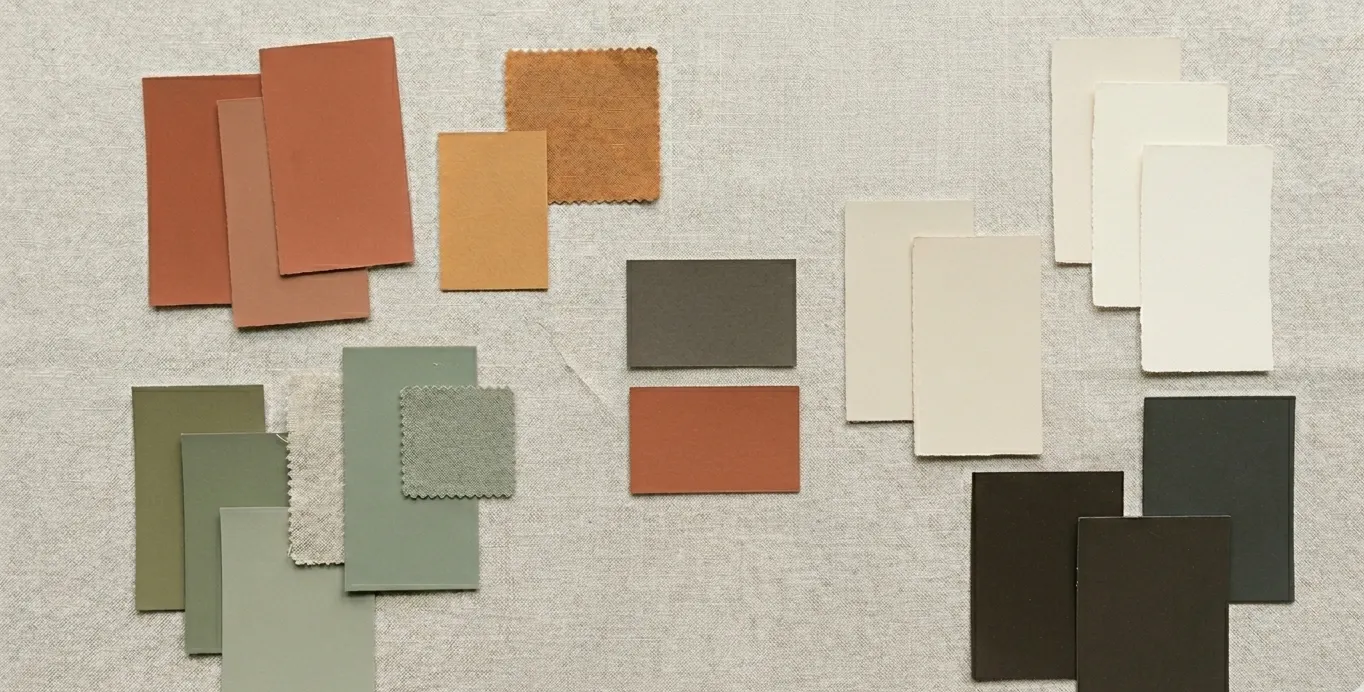
The palettes most prone to this are the ones that look the best on a mood board. Muted sage. Dusty rose. Warm clay. These colors feel cohesive because they share a narrow brightness range. That’s exactly what makes them fail when one sits on top of another as text.
The fix is rarely dramatic. A few targeted adjustments. No rebrand required.
The performance specs: what WCAG requires
WCAG 2.1 Level AA sets two thresholds. Think of them as minimum specs for legibility:
- Normal text (under 24px regular or ~19px bold): 4.5:1 contrast ratio
- Large text (24px+ regular or ~19px+ bold) and meaningful UI components (input borders, icons that convey information): 3:1 contrast ratio. Decorative borders have no requirement.
What’s a contrast ratio? A measurement of brightness difference between two colors, on a scale from 1:1 (identical) to 21:1 (black on white). Check any pairing at webaim.org/resources/contrastchecker.
These aren’t abstract guidelines. In April 2024, the Department of Justice published a final rule adopting WCAG 2.1 AA as the standard for state and local government websites under ADA Title II, with compliance deadlines starting April 2026. As of March 2026, the enforcement timeline is facing potential changes. ADA Title III already covers private businesses, and accessibility-related lawsuits have increased steadily over the past five years.
Then there’s the readership math: 1 in 12 men and 1 in 200 women have some form of color vision deficiency. That’s roughly 8% of your male visitors. If your body text doesn’t clear these specs, a measurable percentage of your audience is straining to read you.
The palette isn’t the problem. The interaction between colors is. A swatch can be beautiful on its own and unreadable as text on a specific background.
Five patterns that cause visual fatigue
Color contrast issues tend to cluster around the same patterns. All five share a root cause: colors that are too close in brightness value.
About Us
We help small businesses build websites that work. Every project starts with understanding your goals and audience, then designing pages around what actually drives inquiries.
Photo by Sarah Chen · Licensed under Creative Commons
We help small businesses build websites that work. Every project starts with understanding your goals and audience, then designing pages around what actually drives inquiries.
This isn’t about bad taste. It’s a knowledge gap that even professional designers fall into. Clients invest in professional branding only to find the deliverable didn’t account for web accessibility requirements at all. We’ve seen it with our own clients. One restaurant group faced a real accessibility lawsuit. It happens, and it’s happening more often.
The underlying principle: the more “harmonious” a palette feels in a swatch strip, the more likely it has contrast problems in practice. Cohesive, tonal palettes keep every color in a narrow brightness range. That’s what makes them look sophisticated side by side. It’s also what makes them fail as text on a background.
How to audit your palette
Start with the squint test. Then run the numbers.
Step 1. Open WebAIM’s Contrast Checker.
Step 2. Test these specific pairings. Not every combination; just the ones that actually appear on your site:
- Heading color on page background
- Body text color on page background
- Body text on alternate section backgrounds
- Button text on button background
- Link color on page background
- Eyebrow, caption, or small text on page background
- Footer text on footer background
Step 3. Read the results. WebAIM reports pass/fail for normal text (4.5:1 minimum) and large text (3:1 minimum). A pairing that fails for normal text might still clear large text. Context matters.
Here’s a typical earthy palette run through the checker:
| Pairing | Preview | Ratio | Result |
|---|---|---|---|
| Dark charcoal on warm cream | 13.1:1 | ✅ Passes AAA | |
| Clay on warm cream | 4.1:1 | ⚠️ Large text only | |
| Dusty sage on warm cream | 2.2:1 | ❌ Fails everything | |
| Deep clay on warm cream | 5.0:1 | ✅ Passes AA |
The pattern is clear. Darker colors pass. The mid-tones, the ones that give your palette its personality, are the ones that fail as text.

To see how these issues compound for visitors with color vision deficiency, upload a screenshot of your site to Coblis, a free color blindness simulator. The subtle distinction between your text and background may vanish entirely under deuteranopia or protanopia simulation.
How Squarespace’s 5-slot system creates the problem
This is where most Squarespace accessibility guides stop being useful.
Squarespace 7.1 gives you 5 color slots arranged lightest to darkest, with an accent in the middle. From those 5 base colors, it auto-generates 10 section themes: Lightest 1, Lightest 2, Light 1, Light 2, Bright 1, Bright 2, Dark 1, Dark 2, Darkest 1, Darkest 2.
Each theme controls dozens of settings: text colors, button colors, backgrounds, links, borders. You apply themes section by section. Change a theme, and every section using it updates.
The problem: Squarespace’s auto-generation algorithm doesn’t check contrast. It maps colors to roles based on slot position. Your 5 base colors might individually be fine, but the auto-generated themes create pairings you never chose. A color that works as a background gets assigned as text in a theme you didn’t preview. The result is on your live site.
Here’s the difference between default slot loading and intentional mapping:
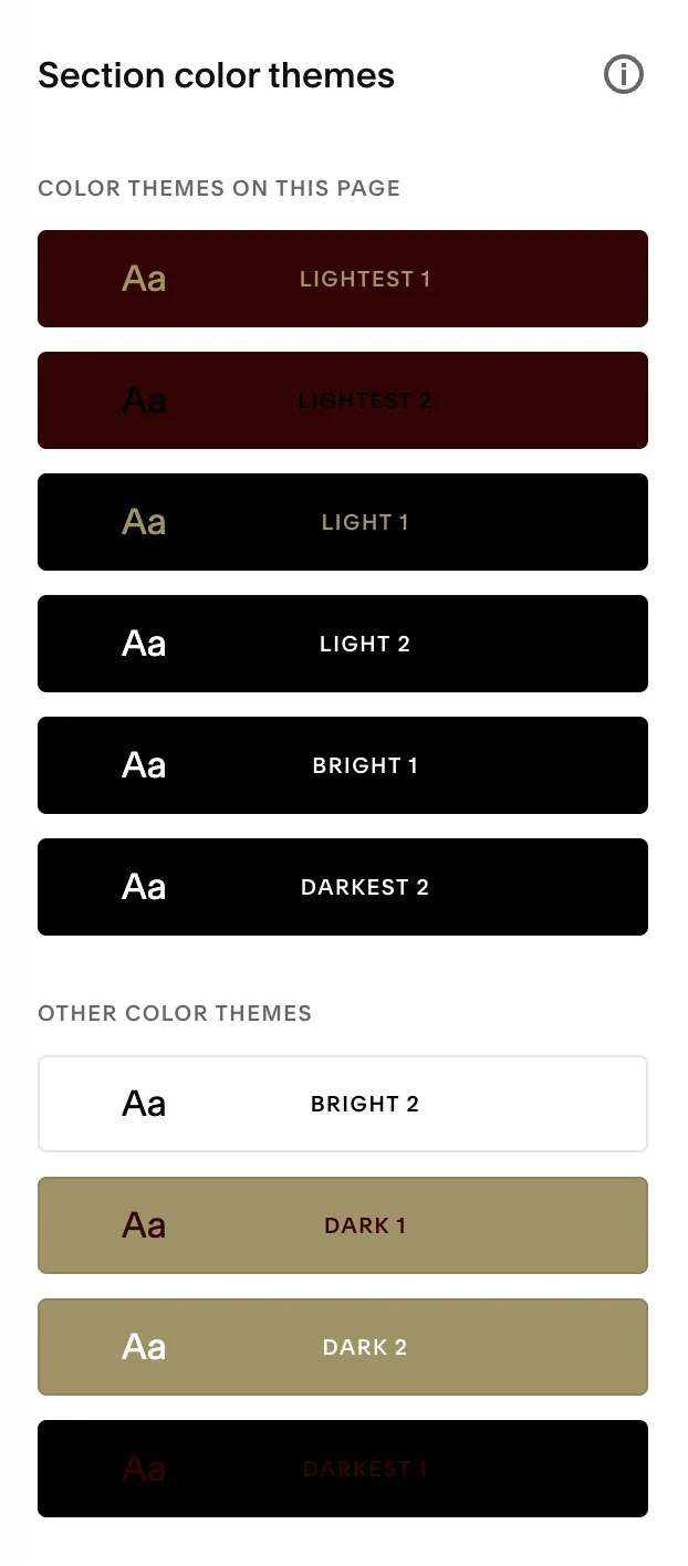
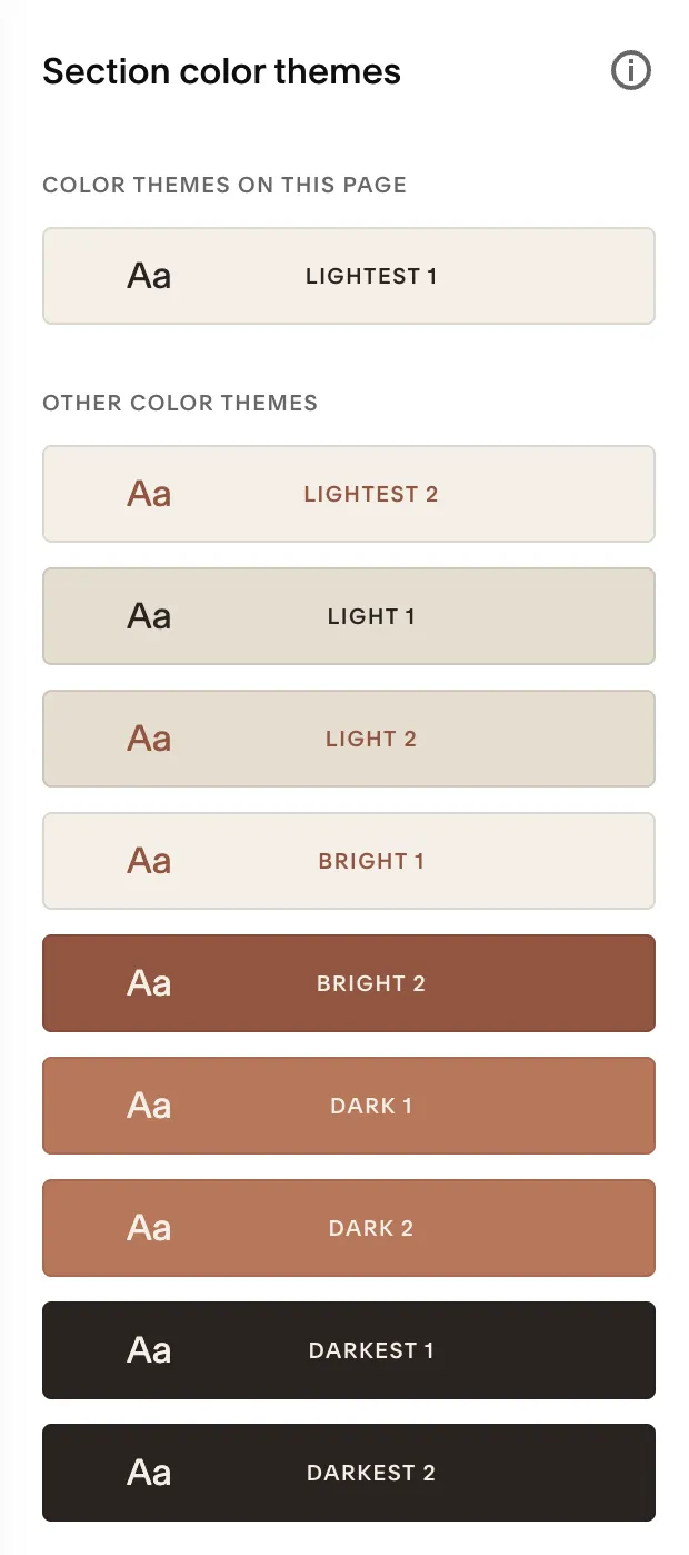
Same 5-slot system. Same concept. On the left, gold text on black, dark text on dark backgrounds. Most themes unusable. On the right, every text pairing is readable. The difference is how the colors are assigned to slots.
What to do about it:
- Use 2-3 themes, not 10. Pick the ones you’ve verified for contrast and stick with them.
- Check themes after loading your palette. Click through each theme in the Design panel. Look at the text/background combinations it creates.
- Override individual theme settings when needed. Changes are global to that theme, so every section using it will update.
- Slot order matters. Lightest value in Slot 1, next lightest in Slot 2, accent in Slot 3, dark in Slot 4, darkest in Slot 5. This produces the most usable auto-generated themes.
The 6-role framework
A design system for mapping your brand colors to Squarespace’s 5-slot architecture. Each color gets a job. One role lives outside the palette entirely.
- Canvas — Primary page background. Covers 70%+ of your site. Not pure white. Use a warm or cool off-white that carries a trace of your brand’s undertone.
- Shadow — Secondary section background. Creates visual separation between sections without introducing a new hue. Close to Canvas but noticeably different.
- Signature — Your brand color. The one people associate with your business. Often too light for small text on its own, which is why you need Action.
- Action — A functional version of Signature, darkened enough to pass 4.5:1 for small text. Same hue family, deeper. This is how you preserve brand identity while clearing contrast specs.
- Ink — Primary text and headings. Near-black, not pure black. Should share the warm or cool undertone of your Canvas. The Ink-on-Canvas pairing is the most critical contrast relationship on your site.
- Glow (applied manually) — A mid-tone accent for decorative use: thin borders, dividers, pill backgrounds behind dark text. Too light for text. Works as a background or decorative element. In Squarespace, apply it using the “Custom” color picker in individual block settings or through Site Styles. This bypasses the 5-color palette limit.
Assigning roles before choosing colors forces you to think about what each color actually does on the page. “Does my Ink pass on my Canvas? Does my button text clear my Action color?” The contrast check becomes part of the design process, not an afterthought.
Start from a signature color. Build around it with contrast as a constraint from the beginning. This works better than picking 5 colors you love and checking contrast at the end.
Four ways to fix contrast without changing your brand
Deepen, don’t replace
Darken the failing color by 10-15% for functional use (buttons, body text). Keep the original for decorative use. You retain the same hue and feel, but the darkened version actually passes contrast. This is the Signature-to-Action relationship from the framework above.
Example: Your Signature is #C47457 (warm terracotta). It hits 3.1:1 against your Canvas. Passes for large headings but fails for button text. Deepen to #9C523B (same clay family) and you get 5.0:1. Passes everything. The visual difference is subtle. The accessibility difference is significant.
Shift the role, not the color
A color that fails as text might work as a background. Use your light accent as a pill or tag background with dark Ink text on top, instead of as text color directly. The color still appears on the page. It just has a different job.
Example: Dusty sage ( #A5A58D) fails as text on cream at 2.2:1. As a background behind dark text, it creates a strong accent that passes easily.
Use element-level overrides
Squarespace lets you override colors on individual elements without touching the global theme. Keep your 5-slot palette clean for the auto-generated themes, then apply your “problem” colors manually where they work: a specific border, an individual text block, a shape element.
Adjust typography, not color
A color that fails at 14px regular might pass at 24px bold (where the threshold drops to 3:1). Sometimes the fix is font size and weight, not color. If your eyebrow text fails at 12px, bumping it to 19px bold may preserve the aesthetic while clearing the spec.
The goal across all four strategies is the same: find the smallest adjustment that creates the necessary contrast. Minimize the change and the brand stays intact. If an adjustment isn’t feasible, you make a design call.
Walkthrough: a real palette, start to finish
A warm neutral palette. The kind that shows up on half the therapy and wellness Squarespace sites out there.
The palette:
- Canvas: #F5EFE6 (Bleached Sand)
- Shadow: #E6DCCF (Dune)
- Signature: #C47457 (Mojave Rust)
- Action: #9C523B (Deep Clay)
- Ink: #2D2522 (Obsidian Ember)
- Glow: #E3BAAB (Dusty Dawn, applied manually)
The audit:
| Pairing | Preview | Ratio | Result |
|---|---|---|---|
| Ink on Canvas (body text) | 13.1:1 | ✅ Passes AAA | |
| Ink on Shadow (alt section) | 11.1:1 | ✅ Passes AAA | |
| Canvas on Action (button text) | 5.0:1 | ✅ Passes AA | |
| Canvas on Signature (large headings) | 3.1:1 | ⚠️ Large text only | |
| Glow on Canvas (decorative) | 1.6:1 | ❌ Not usable for text |
Every critical text pairing clears. Signature is reserved for large headings where 3.1:1 meets the 3:1 spec. Glow never appears as text. It’s decorative only: backgrounds and borders.
The Squarespace slot mapping:
| Slot | Role | Color | Why this placement |
|---|---|---|---|
| 1 (lightest) | Canvas | #F5EFE6 | Primary background |
| 2 (light accent) | Shadow | #E6DCCF | Alternate section background |
| 3 (accent) | Action | #9C523B | Squarespace uses Slot 3 for buttons. Action passes for button text; Signature wouldn’t. |
| 4 (dark accent) | Signature | #C47457 | Dark section backgrounds and large text |
| 5 (darkest) | Ink | #2D2522 | Primary text |
Action goes in Slot 3 instead of Signature. Squarespace uses Slot 3 for primary buttons across most auto-generated themes. Put Signature in Slot 3 and every button on the site fails contrast for standard-sized text.
Which themes to use:
- Light 1 (Canvas background, Ink text, Action buttons) — 70% of the site
- Light 2 (Shadow background, Ink text) — testimonials, about sections, alternate bands
- Dark 1 (Signature background, Canvas text) — sparingly, once per page for a quote or accent band
Skip the other seven. They aren’t needed, and some contain pairings you’d have to override.
Same framework, different color family
The framework isn’t limited to warm neutrals. Here’s the same 6-role structure applied to a green and amber palette:
| Role | Color | Hex |
|---|---|---|
| Canvas | Warm cream | #F6F2EB |
| Shadow | Light khaki | #EBE5DB |
| Signature | Forest green | #3D6B4E |
| Action | Deep forest | #2B4F38 |
| Ink | Near-black green | #1E2422 |
| Glow | Warm amber | #D4B896 |
The contrast results:
| Pairing | Preview | Ratio | Result |
|---|---|---|---|
| Ink on Canvas (body text) | 14.1:1 | ✅ Passes AAA | |
| Ink on Shadow (alt sections) | 12.6:1 | ✅ Passes AAA | |
| Canvas on Action (button text) | 8.3:1 | ✅ Passes AAA | |
| Canvas on Signature (all text sizes) | 5.5:1 | ✅ Passes AA | |
| Glow on Canvas (decorative) | 1.7:1 | ❌ Not usable for text |
Same pattern. Canvas and Shadow are warm neutrals. Ink is a near-black that shares their undertone. Signature deepens into Action for functional contrast. Glow is a different hue entirely (amber against green), giving the palette visual range without compromising readability.
The slot mapping follows the same logic: Action in Slot 3 for buttons, Signature in Slot 4 for accent backgrounds. Stick with 2-3 verified themes. Skip the rest.
What else to check after fixing your colors
Color contrast is one of the easier accessibility issues to address. It’s also just one of many. Next steps:
- Heading hierarchy. H1, H2, H3 tags should follow a logical order, not just be sized for looks. Screen readers use heading structure to navigate.
- Alt text on images. Every image needs descriptive alt text. Decorative images get an empty
alt=""attribute. - Keyboard navigation. Can someone tab through your site and use it without a mouse? Buttons, links, and forms all need to be reachable and operable by keyboard.
- Form labels. Every input field needs a visible label or a properly associated
aria-label. Placeholder text alone doesn’t count.
Many Squarespace sites have issues beyond color that are native to the platform and require code to address. A technical SEO audit will surface some of these. A dedicated site audit catches the full range. If you’re on Squarespace specifically, our guide on 7 high-impact SEO changes covers the most common fixes beyond color.
Color is a good starting point. It’s visible, fixable without code in most cases, and makes an immediate difference in how your site reads.
Frequently Asked Questions
What contrast ratio do I need for my Squarespace website to be accessible?
WCAG 2.1 Level AA requires 4.5:1 for normal-sized text and 3:1 for large text (24px+ regular or ~19px+ bold) and meaningful UI components. Level AAA requires 7:1 and 4.5:1 respectively. AA is the accepted standard for most websites. Check any pairing at WebAIM’s Contrast Checker.
How do I check if my color palette meets accessibility standards?
Use WebAIM’s Contrast Checker. Enter the hex codes for your text and background colors. Focus on the pairings that actually appear on your site: body text on page background, button text on button color, heading color on background, footer text on footer background. Test what visitors see, not every possible combination.
Can I use muted or earthy colors and still be accessible?
Yes, but not for everything. Muted mid-tones work for decorative elements, backgrounds, borders, and large headings (where the threshold drops to 3:1). For body text and buttons, you’ll need a deeper version of your accent color that clears 4.5:1. Assign roles to your colors: some do the reading work, some do the aesthetic work.
Why do Squarespace’s auto-generated color themes sometimes fail accessibility?
Squarespace takes your 5 base colors and maps them into 10 pre-set themes. The algorithm distributes colors across roles (text, background, buttons, links) based on position, not contrast. A background color can get assigned as text in a theme you didn’t preview, creating a failing pairing you never chose. The fix: use 2-3 verified themes only, and check what each theme does before applying it.
Do I need to change my brand colors to be accessible?
Almost never. Darken an accent by 10-15% for functional use (buttons, small text). Shift a failing color to a decorative role. Adjust font size so the large-text threshold applies. The palette stays recognizably yours. The adjustments are often imperceptible unless you’re comparing swatches side by side.
What’s the difference between WCAG AA and AAA compliance?
AA requires 4.5:1 for normal text and 3:1 for large text. It’s the standard most websites aim for and the level referenced in legal guidance. AAA is stricter: 7:1 for normal text, 4.5:1 for large text. AAA is worth pursuing where feasible but not always practical with brand color constraints. Hitting AA on all text pairings is the realistic, defensible target.
Your colors are a brand asset and a usability spec. Fixing contrast rarely means starting over. A few strategic adjustments preserve what you love about your palette while making the site effortless to read.
If you want a proper palette audit, or if you’re dealing with broader accessibility issues on your Squarespace site, book a free consultation and we’ll figure out what makes sense.