Open five therapy websites in five browser tabs.
Most of them will look nearly identical: a warm cream or sage background, a fiddle-leaf fig or a sunlit window, and an elegant serif headline about beginning to heal. When I ran a rough color check on the first screens of 35 therapy homepages I’d collected, including some I built, 22 were mostly pale cream, beige, muted sage or soft gray.
Nobody sets out to look like everyone else. It happens because almost every practice aims for “calm,” and most reach for the same handful of templates to get there. The cost shows up when a prospective client sits on their phone at 11pm comparing five therapists. The tabs blur together, and a site that looks like everyone else’s gives that person no reason to pick you.
A distinctive site doesn’t need neon colors or strange typography. It starts from one specific fact about your clients and lets that fact decide the design. Sometimes that makes the site quieter than the norm, like a page built to settle an overwhelmed nervous system. Sometimes it makes the site louder, like a headline that filters out the wrong clients on purpose.
Here are eight design choices that set a practice apart, with real therapist website examples for each. Four of the sites are ones I built, and the captions say which. I looked at every site in early November 2026, so some details may have changed since.
1. The first screen: orientation in five seconds
The first screen has to tell a visitor who you treat, where you practice and how sessions work.
The person reading is often anxious or distracted, and in many cases they’re a worried parent or partner doing the research on someone else’s behalf. If they can’t tell within a few seconds that you treat their issue in their state, they close the tab and go back to the search results. The typical therapy homepage puts an abstract landscape behind a headline like “Find Your Balance,” and the visitor has to dig through paragraphs to learn whether the therapist works online or sees teenagers.
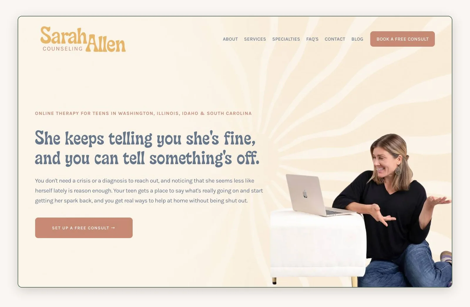
This counseling practice answers all three in one glance. The photo at the top shows the counselor sitting on the floor, mid-gesture, beside a laptop on an ottoman, which tells a parent that sessions happen online and that she’s easy to talk to. The headline speaks in the parent’s unspoken thought: “She keeps telling you she’s fine, and you can tell something’s off.” The casual photo lacks the polish of a studio portrait, and that’s the point.
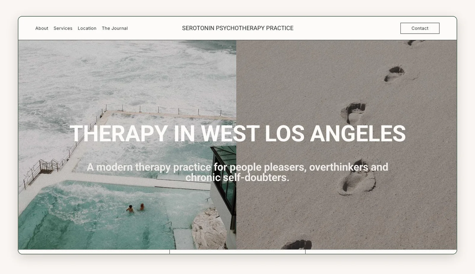
A practice in West Los Angeles leads with its audience. The headline says “Therapy in West Los Angeles,” and the line beneath it reads “A modern therapy practice for people pleasers, overthinkers and chronic self-doubters.” Someone in that group recognizes themselves immediately. The ocean photos set a mood rather than a place, so the location rests on the headline alone. If you show a landscape, one from your own neighborhood does double duty.
2. Photography and imagery: what the photos promise
Your photos tell a visitor what kind of room they’re about to walk into, in person or online, before they read your bio.
The common habit is stock photography: hands around a ceramic mug, stacked river stones, a model walking on a beach. The visitor knows nobody in those photos works at the practice, so the images signal “generic” and keep them at a distance.
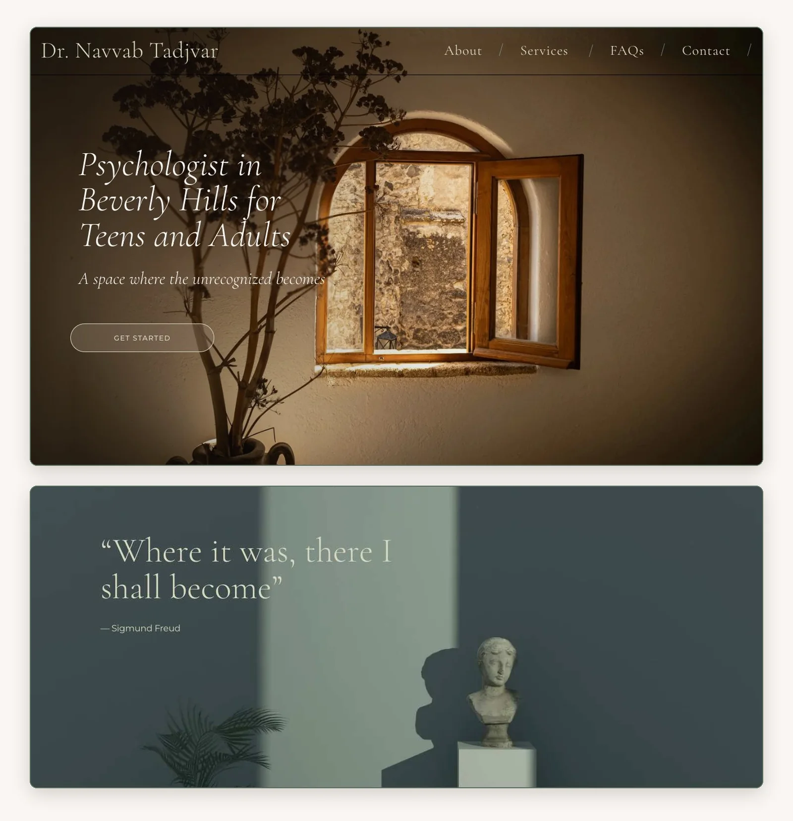
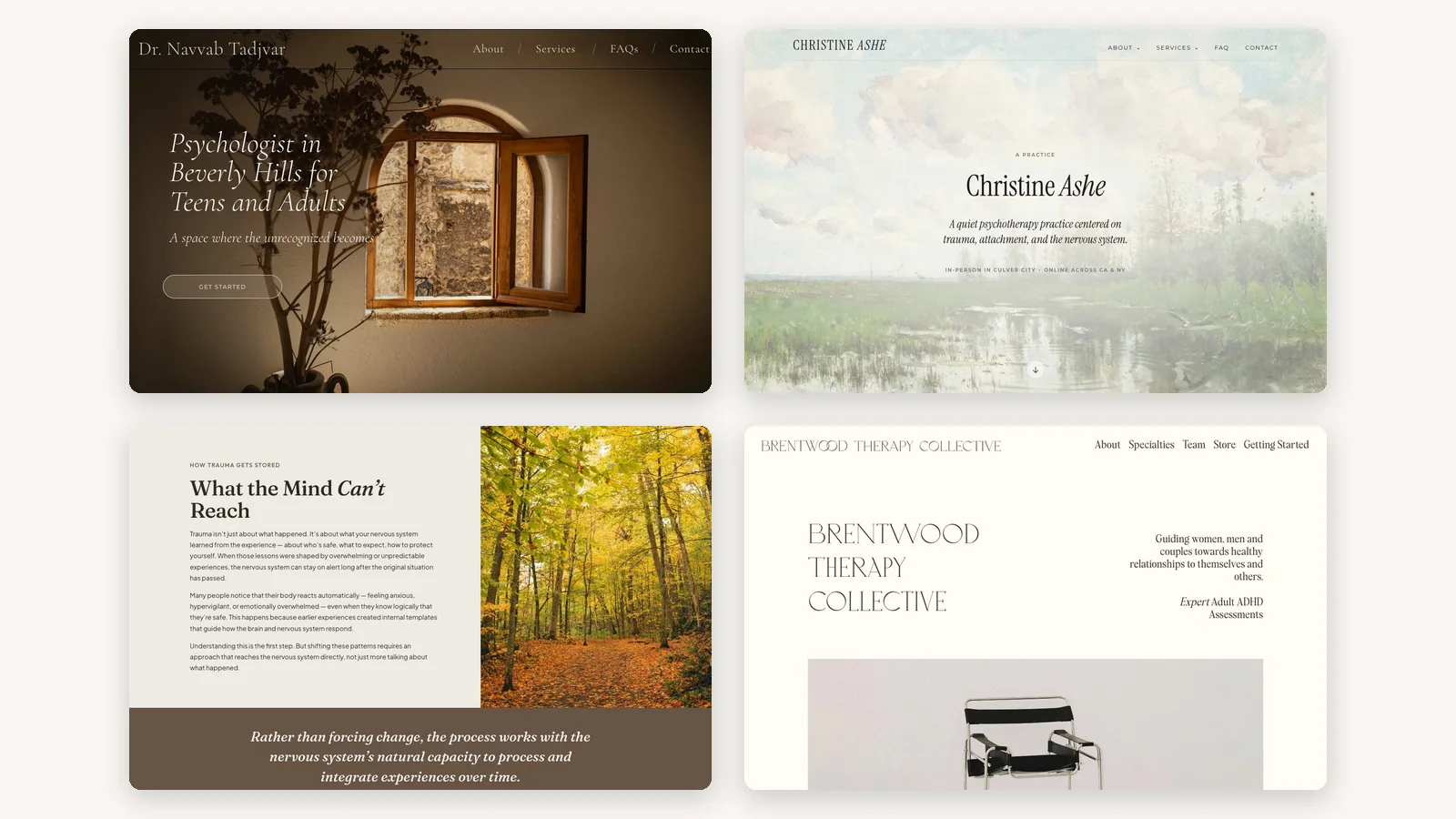
drnavvabtadjvar.com: the top of the homepage and the quote section. I built this site.
One psychologist I built a site for trained in philosophy as well as psychology, and his stated aesthetic was light academia. His brief asked for symbolic images: light and shadow, pathways, architecture, books. The top of the page is an open wooden window in an old stone wall, the one he liked best of the options I showed him. His one condition was that the headline stay out of the window, so the text sits on the plain wall to the left and the window gets the right half of the screen to itself. Further down, a classical bust stands in a slant of light under a line from Freud, “Where it was, there I shall become,” and the closing section sits over a wall of old books.
These images work where a stock mug doesn’t because they were chosen for him and say something about how he thinks. Symbolic imagery still has a cost, though. A page made only of windows and statues keeps the visitor at arm’s length, so his own smiling portrait comes right after the opening screen. The metaphor sets the tone, and the person shows up one scroll later.
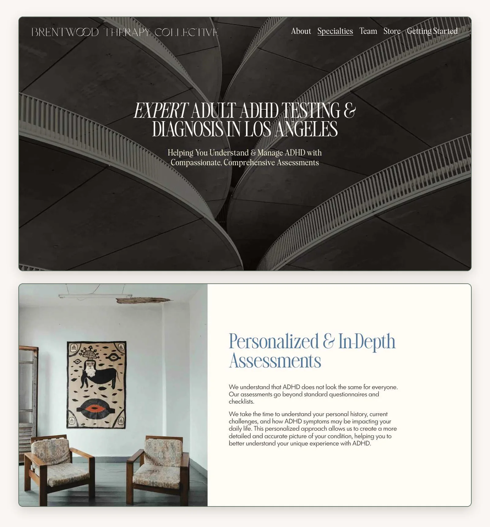
brentwoodtherapycollective.com: the ADHD testing page. I built this site.
A group practice I built for goes further. Its brand kit, created by the studio Matcha Had Me, allows no people in the photography at all: only chairs, flowers, interiors, art, shells and buildings. The ADHD testing page opens on a black-and-white photo of curved concrete balconies, an image you’d expect on an architecture site, and the interiors further down are empty, quiet rooms. That rule does more than any palette to set the site apart, because two people on a couch is the most recognizable photo in the category. The cost is warmth: nobody’s face appears on the first screen. For an adult booking a formal assessment, the composed, orderly feel suits what they’re buying.
3. Typography: a typeface with a point of view
Type carries a site’s personality even when the colors stay soft, and it’s the cheapest way to stop looking like a template.
Most therapy sites set a thin, elegant serif for headlines and a neutral sans for everything else. It reads as tasteful, and it reads the same on every site.
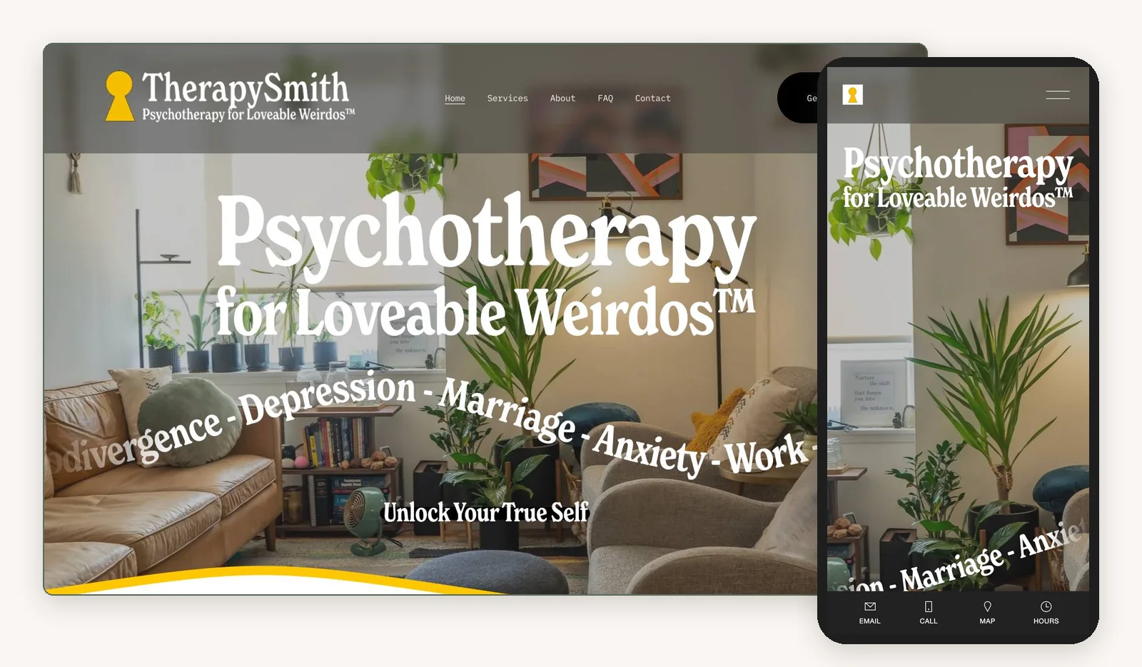
therapysmith.com on desktop and on a phone.
One practice turns its headline into a filter. “Psychotherapy for Loveable Weirdos™” is set in a soft, chunky condensed serif at an enormous size, over a photo of the real office. Beneath it, 25 presenting issues curve across the photo, with non-monogamy, polyamory and neurodivergence alongside stress and depression, and the body text is set in a typewriter-style monospace, which adds personality but makes long passages harder to read on a phone. Creative and neurodivergent visitors feel recognized in a second. Someone looking for a quiet medical office leaves, which is the point of a filter. The trade-off is that the top of the page has no button, so the boldest moment on the page doesn’t offer a next step.
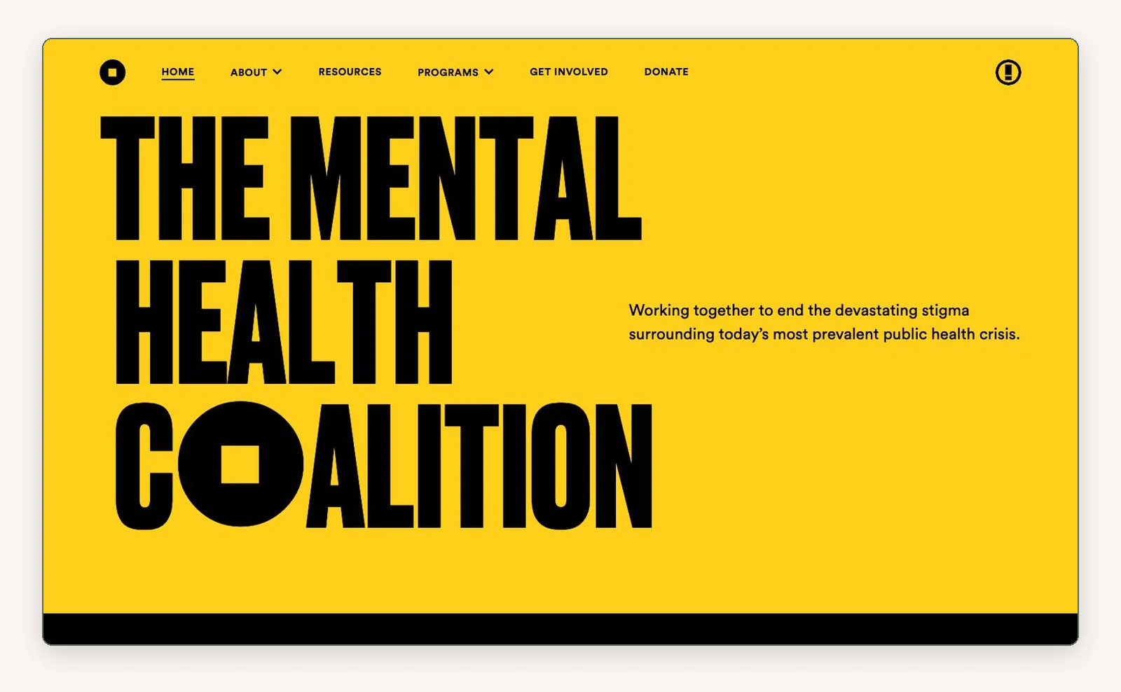
This mental health nonprofit isn’t a private practice, but its type shows how far one idea can go. Every “O” in its headlines is replaced by a black circle with a square cut out of it, a square peg in a round hole, and a line on the page spells it out: “When we all accept each other’s differences, everyone fits.” The page uses yellow and black and almost nothing else. A solo practice won’t build a whole identity system, but it can borrow the principle: one idea, one mark, used everywhere.
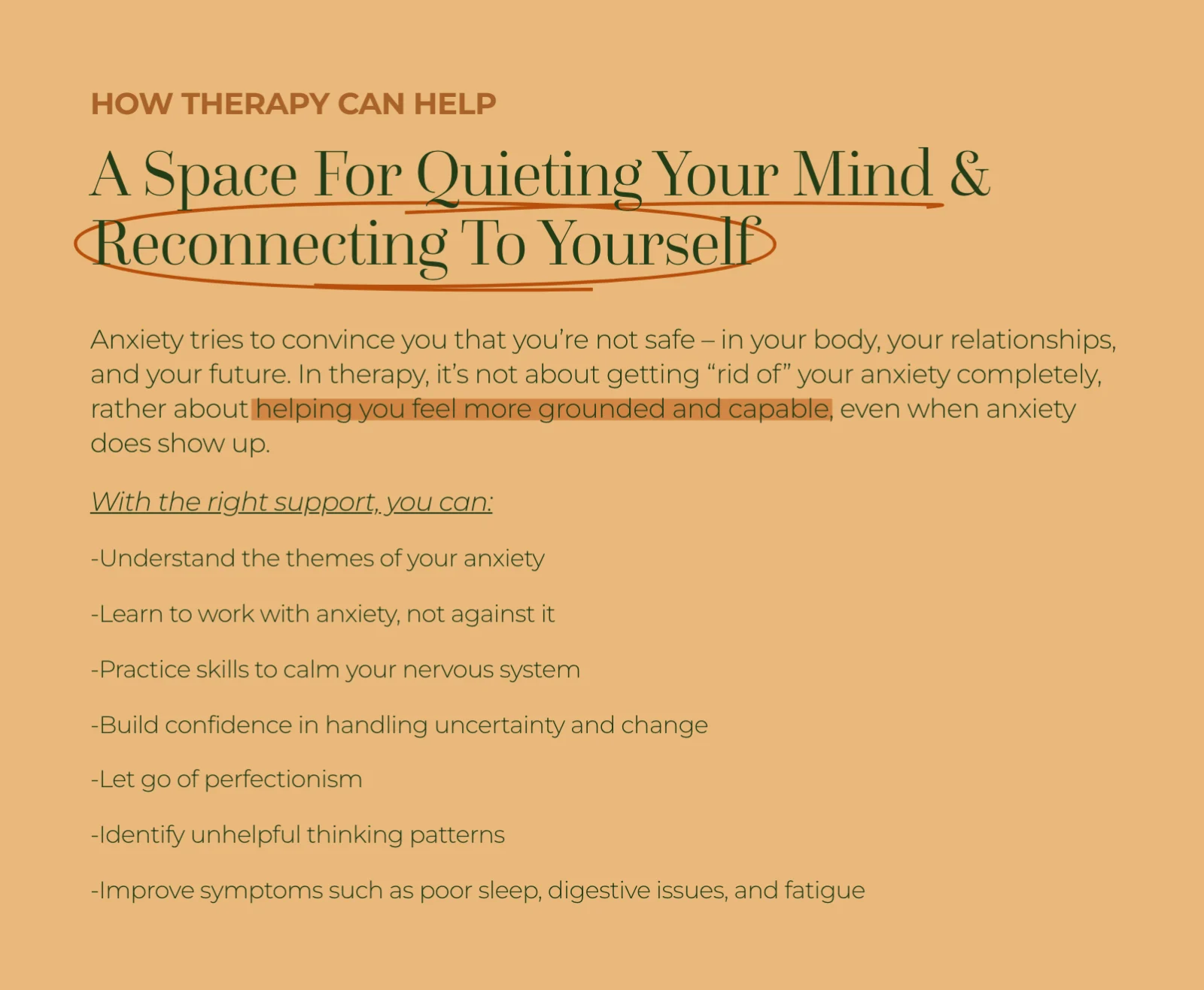
megjonespsyd.com: the anxiety page.
A therapist who works with teens, college students and young adults puts hand-drawn marks on the headings of her anxiety page. A loose orange circle rings “Reconnecting To Yourself,” a squiggle runs under “Quieting Your Mind,” and highlighter swipes cross phrases in the paragraphs. The page looks like a student’s annotated notes, set in burnt orange and tan, which suits the people she sees. Marks like these work best when they’re rare, so save them for the one or two lines that matter most.
4. Color: pulling a palette from the client’s world
When every therapist uses muted pastels to look calm, the color stops saying “calm” and starts saying “same.” A palette taken from your clients’ world avoids that.
There’s a practical problem with soft palettes too. I ran an automated design check on the 16 mental health websites I looked at most closely for this post, and 10 had text below the WCAG contrast minimum, the standard measure of whether text is easy to read. Two of those 10 are sites I built, and I’ve since fixed both. Pale gray text on cream looks gentle and reads badly, especially on a phone in sunlight. If you keep a quiet palette, check that your body text is dark enough to read.
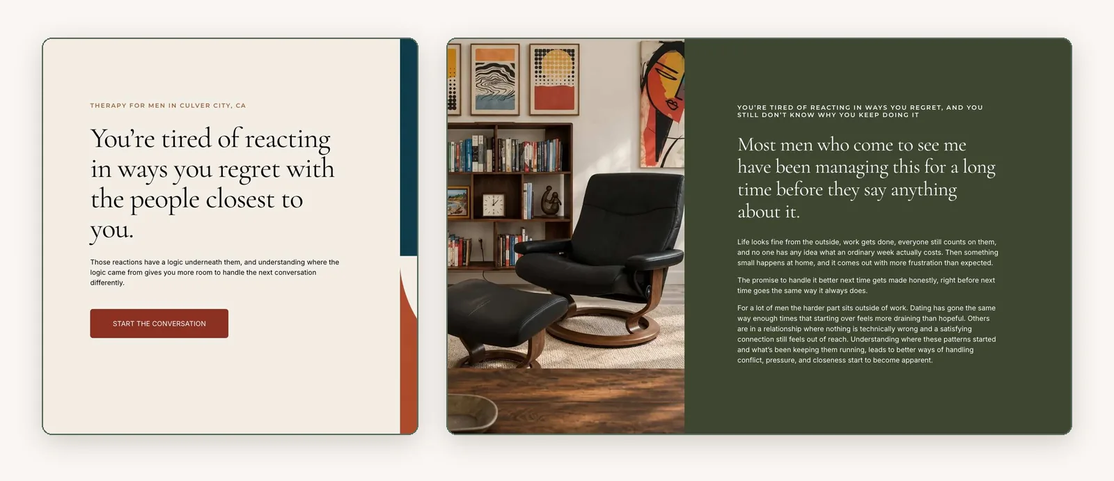
drcolinmattingly.com: the headline and the section below it.
One therapist works with men, many of whom wouldn’t describe what they’re dealing with in therapy language. His site uses a mid-century palette of deep teal, rust, ochre, olive and navy. The office photo shows dark wood shelving, a black leather Eames-style lounge chair and abstract prints that pick up the site’s colors. It looks like a study, a room a skeptical man would already sit in. Those darker, heavier tones will feel wrong to someone looking for a bright, airy space, but those aren’t the people he’s trying to reach.
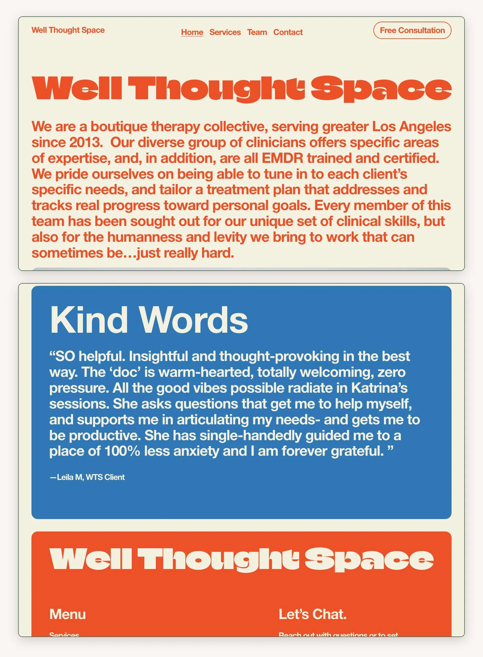
wellthoughtspace.com: the top of the homepage and the testimonial and footer blocks near the bottom.
A group practice in Los Angeles leaves the therapy palette behind entirely. Red-orange, mustard yellow and bright blue blocks sit on cream, under a wordmark set in a very wide display face. It’s one of the few sites here you’d recognize from its colors alone in a row of five tabs.
The color carries the brand’s attitude more than anything about its clients, and the trade-off shows at the top of the page, where a nine-line paragraph in large bold type gives the eye a lot to take in at once. Bold color works best when it supports a short, clear message and a visible next step.
You can check your own site against the category in two minutes. Open it in a tab next to four local therapists in your specialty and look at the five side by side. If yours disappears into the same wash of sage and oatmeal, pull one accent color from something your clients would recognize: a material in your office, a textile, the landscape of your town.
5. Layout and rhythm: breaking up the beige
Changing the shape of each section keeps a reader moving down the page.
Anxious visitors don’t read every word. They scroll quickly, looking for phrases that describe what they’re going through. The most common layout habit is to drop every service, symptom and bio into identical three-column cards, which splits related ideas into separate boxes and makes a therapy practice look like a software pricing page.
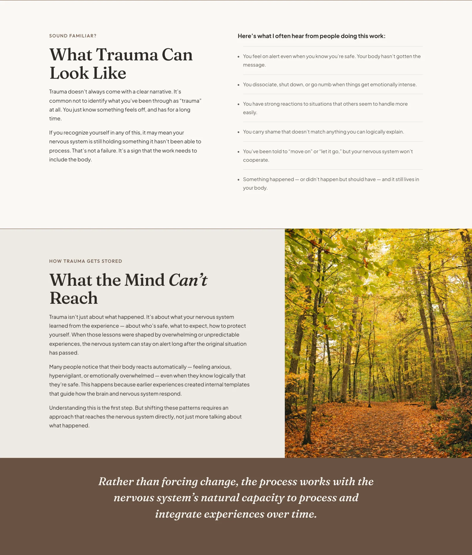
therapywithesma.com: three sections of the trauma therapy page. I built this site.
On another site I built, the palette sits close to the common look: cream, taupe and brown. That palette came from the therapist’s brief, which asked for slow pacing and a steady feel. My first round of mockups showed the risk. Every section was a grid of cards, the backgrounds cycled through four or five nearly identical creams, and the accent color showed up on the buttons, the labels, the backgrounds and the borders. The page read as one continuous beige.
So the variety had to come from structure. The trauma page changes shape every time a section changes job. A list of symptoms runs as rows with thin dividers. A long explanation of how trauma gets stored sits beside a full-height photo of an autumn path. A single sentence about the nervous system gets a dark brown band to itself, and the dark tone carries weight because the page saves it for moments like that. I kept the accent color for buttons so it would mean “tap here.” The cost is length: a page with this many distinct sections runs long on a phone, and the booking button from the top doesn’t appear again until near the end.
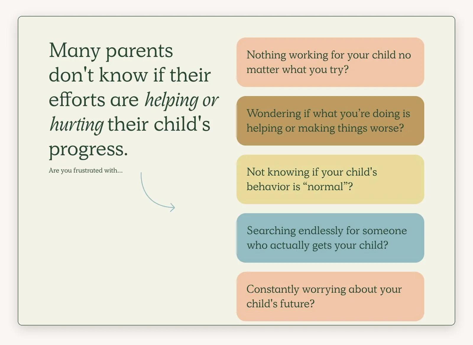
childtherapycenterla.com: the second section of the homepage.
A child therapy center in Los Angeles builds one section entirely around the parent’s worries. Five concerns sit in colored panels, each phrased the way a parent thinks it late at night: “Not knowing if your child’s behavior is ‘normal’?” A parent sees their own week on the screen.
The trade-off is length. The homepage is very long, with several looping bands of scrolling text, and a parent on a phone scrolls a long way to reach the services. Varied sections should make the information clearer, and a page that keeps going loses the parent before the end.
6. Copy as design: line breaks, lists and the client’s own words
The way copy sits on the page is a design decision. Long blocks of clinical prose push a nervous reader away, while short lines in the client’s own words, with room around them, give the eye places to land.
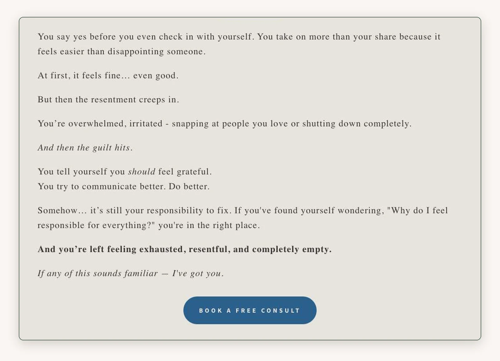
counselingwithnicole.com: the section below the opening.
A counselor who works with women dealing with burnout and people-pleasing uses copy as the layout of her homepage. Instead of a dense paragraph, she breaks the client’s inner monologue into separate lines with space between them: “You say yes before you even check in with yourself.” “At first, it feels fine… even good.” “And then the guilt hits.” Each line reads like a step down the page. Further on, a “Maybe you…” list lets the visitor check off what applies, and a four-color “Imagine…” grid shows what life could look like afterward. The photography stays close to the common look, and the copy is specific enough that the page still feels like hers.
The same idea works at the level of single words. A perinatal group practice names situations a generalist wouldn’t know to name, such as termination for medical reasons (TFMR), pregnancy after loss and postpartum OCD. A visitor who has lived one of those recognizes the term and knows from one line that this practice has seen it before.
7. The conversion path: the next step on a phone
A visitor who’s ready needs a visible next step, and a visitor who isn’t ready needs a smaller one.
Many people looking for a therapist find you on a phone. If your phone layout hides your fees or your location, or sends them to a long form, some of them will close the tab. The common setup is a single contact button in the header that opens a form with a page of open-ended questions, and an overwhelmed person often doesn’t have the energy to write a paragraph about their life into a small text box.
The child therapy center adds a second, smaller step at the top of its homepage. Next to “Book a Free Call,” there’s a second button phrased as the parent’s own question: “Is My Child’s Behavior Normal?” It leads to a free five-minute video guide. A parent who isn’t ready to call a therapist about their child still has something to click, and the practice gets an email address. The cost is the guide itself, which someone has to make and keep current.
Putting the practical facts on the page is a smaller step still. One therapist’s homepage says it plainly: “Sessions are 50 minutes and $250. I’m out of network and can provide a monthly superbill for possible partial reimbursement, depending on your plan.” The ADHD testing page I built for the group practice says it’s out of network, links to a guide to getting reimbursed, and when I checked, it listed the wait for an intake as one week. Someone who can’t afford it finds out before the call, which saves both sides the conversation.
Keep the booking button in reach on a phone, too. Some platforms’ built-in contact bars slide off the screen when the visitor scrolls down and only return at the top of the page, which is the moment a reader who has made up their mind would reach for one. If yours behaves that way, keep a booking button in the header as well.
Try this on your own site. Hold your phone in one hand and use only your thumb to find your fee, the area you serve and your booking form. If any of those takes more than two taps or needs pinching to zoom, the phone layout needs work.
8. Motion: pacing for a nervous system
On a therapy website, movement should help a visitor settle, and it should switch off when their device asks it to.
Many visitors arrive already on edge. Slide-in banners, pop-ups and fast parallax effects add to that, and some people feel physically uncomfortable with motion on screen. Pages that hijack the scroll or fly elements in from the sides distract from what the therapist is saying.
christineashe.com: the top of the homepage, recorded. The watercolor marsh drifts slowly behind her name. I built this site.
One therapist I built for works with trauma and the nervous system, and her brief for the site came down to one idea: visiting it should feel like a small experience of being regulated. She wanted a visitor’s body to settle before they read anything. The homepage opens on a watercolor marsh that moves very slowly. On a laptop, the page then advances in five full screens that settle into place one at a time. The inner pages switch to black-and-white editorial photographs with plenty of white space.
Snapping takes over the scroll, which is exactly the kind of movement I warned about above, so it needed limits. It moves slowly, it only happens on a laptop, and every piece of the motion listens to the visitor’s device: if someone has turned on the “reduce motion” setting, the snapping turns off and the video stays paused. On phones, the page scrolls normally for everyone. The trade-off is the booking button. Because the homepage is paced so slowly, the first invitation to reach out comes in the final section, and a visitor who’s ready sooner has to find it in the menu.
What these sites have in common
The strongest of these sites start from a fact about the people the practice serves: they’re parents deciding for a child, men who don’t say “anxiety,” women who say yes before they check in with themselves, or clients who need to settle before they’ll read a word. The design follows from that fact, and that’s why you couldn’t swap the logos between them.
To test your own site, cover your name and ask whether a stranger could tell the homepage is yours. If they couldn’t, the fix usually starts with one sentence about your clients, before anyone touches the palette. How your site looks also decides how much of your search traffic turns into inquiries, which I wrote about in why website design matters for therapists. If you’d like help with your own site, I design and build websites for therapists, and a free consultation is the place to start.
Frequently asked questions
What should a therapist put on their website homepage?
The first screen should say what you treat, who you see, where you practice and whether sessions are online or in person. Below that, include a real photo of you or imagery chosen for your clients, the symptoms or situations you help with in your clients’ own words, your fee and insurance policy, and a booking button that’s easy to reach on a phone.
Should therapists list their fees on their website?
Listing your fee answers the question before someone books a call. Put your session length, your fee and whether you take insurance on your site, and if you’re out of network, say whether you provide a superbill. Visitors who can’t afford the fee find out early, and the people who do book already know what to expect.
Do I need photos of myself on my therapy website?
Most practices should have at least one, because many people want to see who they’d be talking to before they reach out. Where it goes is a design choice. You can lead with a photo of yourself at work, open with a symbolic image and put your portrait one scroll down, or, in a group practice, keep people out of the brand photography and show each clinician on their own page.