

You write a 2,000-word blog post. You research it, edit it, add a good featured image. You publish it.
Then you look at the page. It looks exactly like every other Squarespace blog. No way to navigate it. No sense of how long it is. No way to share it. The content is yours, but the reading experience is Squarespace’s default — and it’s the same default that a million other sites are using.
That’s the gap: not the writing, but the page itself.
This guide covers 5 plugins that close that gap. Three are free snippets you can copy-paste in 10 minutes. Two are paid tools (one-time purchases, not subscriptions). All of them install through Squarespace’s Code Injection, and once they’re set up, every post on your blog benefits automatically.
One thing upfront: the plugins in this guide use Squarespace’s Code Injection feature, which requires a Core plan or higher.
How to install any plugin on Squarespace
The free snippets all install the same way:
- Go to your blog page in the Squarespace editor
- Hover over the blog collection and click the gear icon
- Select Advanced in the panel that opens
- Paste the snippet code into the Blog Post Code Injection field
- Save
Code injected here runs on every blog post automatically — you don’t need to touch individual posts. The paid plugins (TOC Pro, Carousel Pro, Footnotes Pro) each include a step-by-step deployment guide with screenshots, plus a configuration guide for customizing the look and behavior.
Before the plugins: set up your author profile
This isn’t a plugin, but it takes 10–15 minutes and it matters.
Most Squarespace blogs either show no author at all, or display a name in small text below the title. For a business blog where your content is meant to demonstrate expertise, that’s a missed opportunity.
An author profile does two things:
- Builds credibility — a name, photo, and one-sentence bio tell readers there’s a real person behind the words.
- Helps with E-E-A-T — Google’s quality guidelines look for clear author attribution, especially in YMYL (your money or your life) content like health, finance, and legal topics. If you’re a therapist writing about anxiety, a visible byline with your credentials is more than a design choice.
Set up authors in Settings → Blogging → Authors. Assign an author per post in the post editor. Then go to your blog page settings, open the Format tab, and enable Show Author Profile — without this toggle, the author section won’t appear at all. The default styling is minimal — here’s a CSS snippet that turns it into a proper card:
<style>
/* Author Profile Card — paste into Blog Code Injection or site-wide Code Injection */

/* Card container */
.blog-item-author-profile-wrapper {
  background: #ffffff !important;
  border: 1px solid #dfd6c8 !important;
  border-radius: 16px !important;
  padding: 32px !important;
  max-width: 720px !important;
  display: grid !important;
  grid-template-columns: 70px 1fr !important;
  gap: 0 24px !important;
  align-items: start !important;
}

/* Break the <a> wrapper so avatar and name become grid items */
.blog-item-author-profile-wrapper > a:first-child {
  display: contents !important;
}

/* Avatar */
.blog-item-author-profile-wrapper .author-avatar {
  grid-column: 1 !important;
  grid-row: 1 / 4 !important;
  width: 70px !important;
  height: 70px !important;
  min-width: 70px !important;
  min-height: 70px !important;
  max-width: 70px !important;
  max-height: 70px !important;
  border-radius: 50% !important;
  overflow: hidden !important;
  display: block !important;
  align-self: start !important;
  margin: 0 !important;
  border: none !important;
  box-sizing: border-box !important;
}

/* Avatar image — override SQS inline styles */
.blog-item-author-profile-wrapper .author-avatar-image {
  width: 100% !important;
  height: 100% !important;
  object-fit: cover !important;
  position: static !important;
  left: auto !important;
  top: auto !important;
  font-size: initial !important;
}

/* Author name */
.blog-item-author-profile-wrapper .author-name {
  grid-column: 2 !important;
  grid-row: 1 !important;
  font-size: 1.25rem !important;
  font-weight: 700 !important;
  color: #2e2a26 !important;
  display: block !important;
  margin: 0 0 12px 0 !important;
  line-height: 1.3 !important;
  text-decoration: none !important;
}

/* Bio */
.blog-item-author-profile-wrapper .author-bio {
  grid-column: 2 !important;
  grid-row: 2 !important;
  margin: 0 !important;
}

.blog-item-author-profile-wrapper .author-bio p {
  font-size: 1rem !important;
  line-height: 1.7 !important;
  color: #5c554d !important;
  margin: 0 !important;
}

/* Hide the raw URL link */
.blog-item-author-profile-wrapper .author-website {
  display: none !important;
}

/* Mobile: stack vertically */
@media (max-width: 480px) {
  .blog-item-author-profile-wrapper {
    grid-template-columns: 1fr !important;
    justify-items: center !important;
    text-align: center !important;
    padding: 24px !important;
  }

  .blog-item-author-profile-wrapper .author-avatar {
    grid-column: 1 !important;
    grid-row: auto !important;
    margin-bottom: 16px !important;
  }

  .blog-item-author-profile-wrapper .author-name {
    grid-column: 1 !important;
    grid-row: auto !important;
  }

  .blog-item-author-profile-wrapper .author-bio {
    grid-column: 1 !important;
    grid-row: auto !important;
  }
}
</style>
Copy the snippet above and paste it into your Blog Code Injection (footer) or site-wide Code Injection. It turns the default author block into a bordered card with the avatar pinned to the left and the name and bio beside it.

The 5 plugins
1. Table of contents
A plugin that scans your headings and builds a clickable navigation menu — either at the top of the post or as a sticky sidebar.
The problem it solves: Long posts with no navigation lose readers. Someone lands on your 2,500-word guide, sees a wall of text, and has no idea if the section they care about is near the top or buried at the bottom. They leave — not because the content is bad, but because they can’t find what they came for.
Why it matters: A table of contents gives readers a map before they start reading. It lets them jump to the section they care about. And it creates anchor links that Google can surface as sitelinks in search results — your one result takes up more space on the page than a competitor’s.
We have a free TOC snippet that builds a basic table of contents at the top of each post. For most blogs, it’s enough.
For longer posts — or if you want the reading experience to feel more like a documentation site — Table of Contents Pro adds a sticky sidebar that highlights the active section as you scroll. On mobile, it collapses into a floating bar at the bottom of the screen. One script tag in your site header, and it works on every post.
Most TOC plugins require pasting a Code Block into every individual post. The free snippet and TOC Pro both install once via Blog Code Injection and apply to every post in that blog. If you have multiple blog collections, use site-wide Code Injection instead.
TOC Pro: $38, one-time purchase
2. Scroll progress bar
A thin bar at the top of the viewport that fills as you scroll through the article.
The problem it solves: In a long post, readers lose track of where they are. The browser scrollbar helps, but it’s easy to ignore — especially on mobile where it disappears between touches. A progress bar is a constant, visible signal: you’re 40% through. Keep going.
Why it matters: It’s a small visual cue that signals you’ve thought about the reading experience. News sites and long-form publications use it because it keeps readers oriented. For blog posts over 1,500 words, it’s worth the 10-minute install.
One paste into your blog Code Injection. Customize the color and height to match your site.
Free snippet: Scroll Progress Bar
3. Carousel Pro
A plugin that transforms Squarespace’s Summary Block into a swipeable carousel with four layout options — coverflow, flat, peek, or centered grid.
The problem it solves: You want to feature blog posts on your homepage or service pages, but Squarespace’s Summary Block shows three posts in a static grid. That’s it. Three posts in the space, no interaction, no browsing. If you have 20 posts and a reader only sees the latest three, you’re leaving content buried.
Why it matters: A carousel lets you feature 6–8 posts in the space where a grid shows 3. Readers can browse at their own pace — swiping on mobile, clicking arrows on desktop — instead of scrolling past a wall of cards. It inherits your site’s fonts and colors, so it doesn’t look like a third-party widget bolted onto your design.
One script tag in your site header. Any Summary Block on the site can use it. Autoplay with a visible progress bar, keyboard accessible, and mobile-native swipe.
Carousel Pro: $20, one-time purchase
4. Footnotes Pro
A plugin that turns plain text markers like [1] into interactive footnotes — superscript numbers with hover popovers, smooth-scroll navigation, and back-reference links.
The problem it solves: Citing sources mid-sentence makes text choppy. But leaving claims unsourced undermines credibility — especially in YMYL content like health, legal, or finance topics where readers (and Google) expect references. Manual anchor links work, but they’re tedious to maintain and they pull readers away from the paragraph they were reading.
Why it matters: The hover popover is the key feature. Instead of losing your place every time you want to check a citation, you hover (or tap on mobile) and the footnote content appears inline. Click the superscript to scroll to the full definition. Click the back arrow to return to your spot. Your readers stay in the flow instead of bouncing between references.
Write [1] in the Squarespace editor and add definitions at the bottom of your post. The plugin handles the rest — superscript conversion, popovers, navigation, keyboard accessibility.
Footnotes Pro: $29, one-time purchase
5. Share buttons
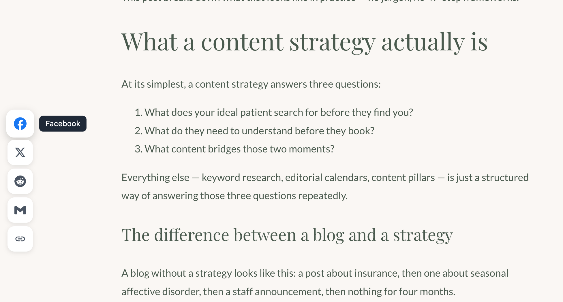
A sticky share bar — fixed to the side of the viewport on desktop, displayed as an inline row below the post on mobile.
The problem it solves: When someone finishes a post and wants to share it, Squarespace gives them nothing by default. Some templates include small social icons buried in the footer metadata, but most readers will never find them. If sharing requires effort, it doesn’t happen.
Why it matters: A visible share bar makes sharing frictionless. The reader doesn’t have to scroll back to the top or hunt for a tiny icon. It’s just there — Facebook, X, Reddit, Gmail, and copy-to-clipboard. It adapts to mobile automatically and uses your post’s URL and title.
One paste into your blog Code Injection. No configuration per post.
Free snippet: Share Buttons
A note on performance
Each plugin adds JavaScript to your page. One or two won’t make a measurable difference. But if you install all five, test your page speed afterward. Run a PageSpeed Insights audit before and after. If your score drops noticeably, prioritize the tools your readers actually use and cut the rest.
How to tell if it’s working
You installed the plugins. Your blog looks better. But is anyone actually staying longer?
What to measure: Open Google Analytics 4 and go to Reports → Engagement → Pages and screens. Look at two numbers for your blog post pages:
- Average engagement time — how long people actively spend on the page. If this goes up after installing a TOC and progress bar, readers are scrolling deeper instead of bouncing.
- Bounce rate — the percentage of visitors who leave without interacting. A lower bounce rate means more readers are clicking, scrolling, or navigating to another page on your site.
Check these numbers before you install anything, then again two weeks after. You don’t need a dramatic shift — even a 10–15 second increase in engagement time across your blog posts means the plugins are doing their job.
If you don’t have Google Analytics set up yet, search for “set up Google Analytics 4” — Google’s official documentation walks you through creating a property and adding the tracking code. It’s free and takes about 15 minutes.
Start with one
You don’t need all five at once. Start with the author profile, the scroll progress bar, and the share buttons. All three are free, take about 10 minutes each, and work on every post without any configuration. That’s the fastest way to make your blog feel like something you built on purpose.
The paid plugins — TOC Pro, Carousel Pro, Footnotes Pro — are worth it when your blog is a real part of your business strategy. When you’re publishing regularly, when posts are driving traffic, and when you want the experience to reflect the quality of the content.
If you want help setting any of this up — or if you’d rather have someone configure everything at once — Book a Free Consultation and we’ll figure out what makes sense for your site.